科研制图模板和颜色选择
Case1:两子图柱状图
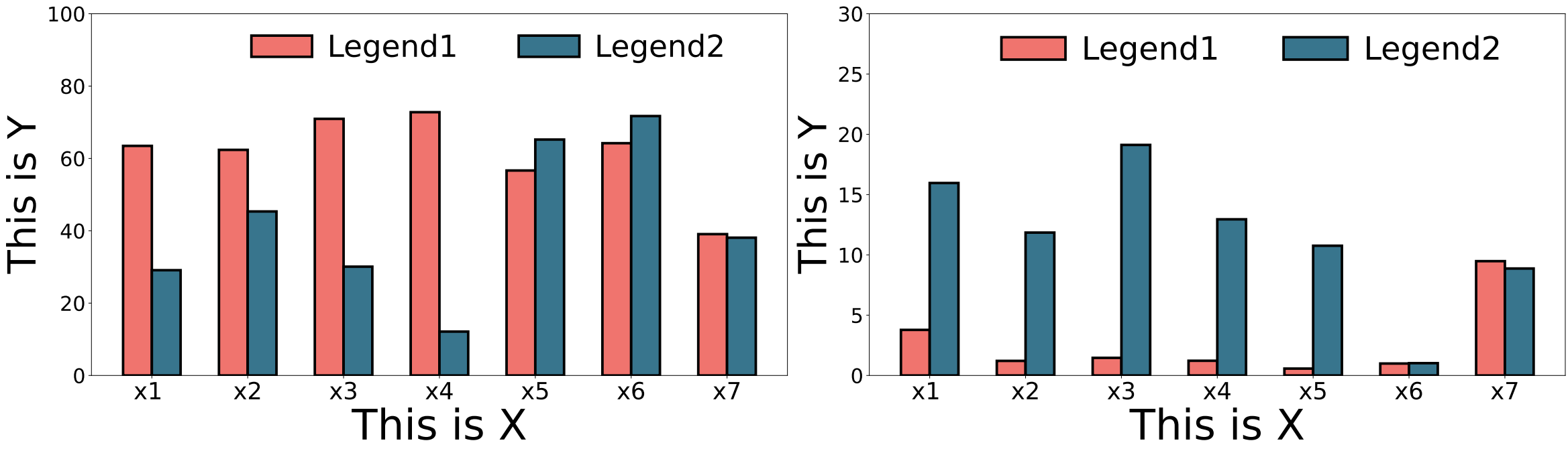
x#encodeing utf-8import matplotlib.pyplot as pltimport numpy as npfont = 16plt.rc('ytick', labelsize=font+8)
# 创建子图fig, axs = plt.subplots(1, 2, figsize=(26, 7.6))# 数据data1 = [0.6347,0.6237,0.7094,0.7278,0.5666,0.6421,0.3907]data2 = [0.291,0.4534,0.3008,0.1213,0.6522,0.7171,0.3809]data1 = [idx * 100 for idx in data1]data2 = [idx * 100 for idx in data2]# 设置颜色color1 = '#FFA406'color2 = '#95252A'color_cycle = [color1,color2]x_values = ["x1 ","x2","x3","x4","x5","x6","x7"] # x轴坐标bar_labels = ['Legend1', 'Legend2'] # 每个坐标下的两个柱的标签
# 设置柱宽和柱间隔bar_width = 0.3bar_gap = 0.02font=26# 设置柱子的颜色color1 = '#f0746e'color2 = '#38758d'# 红 蓝 灰 黄
# 计算每组柱的位置(4根柱子计算公式)bar_positions1 = np.arange(len(x_values)) - 0.5*bar_width # 左边的柱位置bar_positions2 = np.arange(len(x_values)) + 0.5*bar_width # 右边的柱位置
axs[0].bar(bar_positions1, data1,label=bar_labels[0], width=bar_width, color=color1, edgecolor='black', linewidth=3,zorder=10)axs[0].bar(bar_positions2, data2, label=bar_labels[1],width=bar_width, color=color2, edgecolor='black', linewidth=3,zorder=10)
axs[0].set_ylabel("This is Y",fontsize=font+20)axs[0].set_xlabel("This is X",fontsize=font+24)
# 设置x轴刻度在两个柱子的中间x_positions = np.arange(len(x_values))print(x_positions)axs[0].set_xticks(x_positions, x_values, fontsize=font+2)axs[0].set_ylim(0,100)
# 添加图例,无框并排显示legend=axs[0].legend(loc="upper right", fontsize=font+10, bbox_to_anchor=(0.95, 1.02), ncol=2, frameon=False,handletextpad=0.5) # 调整图例位置
data1 = [0.0378,0.0121,0.0146,0.0122,0.0057,0.0099,0.0948]data2 = [0.1596,0.1185,0.1912,0.1295,0.1076,0.0102,0.0887]data1 = [idx * 100 for idx in data1]data2 = [idx * 100 for idx in data2]
axs[1].bar(bar_positions1, data1,label=bar_labels[0], width=bar_width, color=color1, edgecolor='black', linewidth=3,zorder=10)axs[1].bar(bar_positions2, data2,label=bar_labels[1], width=bar_width, color=color2, edgecolor='black', linewidth=3,zorder=10)
# axs[1].set_ylabel("Ratio",fontsize=font+12)axs[1].set_ylabel("This is Y",fontsize=font+20)axs[1].set_xlabel("This is X",fontsize=font+24)
# 设置x轴刻度在两个柱子的中间x_positions = np.arange(len(x_values))print(x_positions)axs[1].set_xticks(x_positions, x_values, fontsize=font+2)axs[1].set_ylim(0,30)
legend=axs[1].legend(loc="upper right", fontsize=font+12, bbox_to_anchor=(0.95, 1.02), ncol=2, frameon=False,handletextpad=0.5) # 调整图例位置
# 调整布局,以防止子图之间的重叠
plt.tight_layout()fig.savefig("model1.pdf", format="pdf", bbox_extra_artists=(legend,),bbox_inches="tight")# 显示图形plt.show()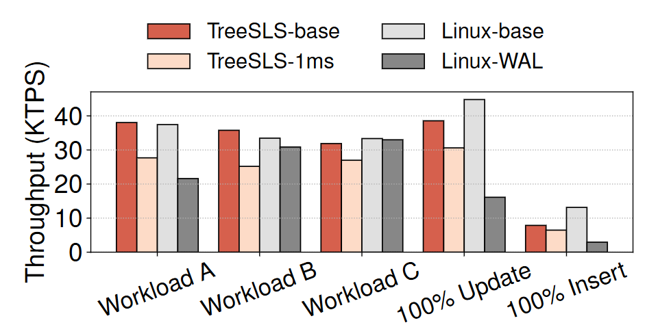
颜色选择:图源TreeSLS(SOSP'23)
xxxxxxxxxxCOLOR1 = '#d6604d'COLOR2 = '#fddbc7'COLOR3 = '#e0e0e0'COLOR4 = '#878787'
Case2:三子图柱状图
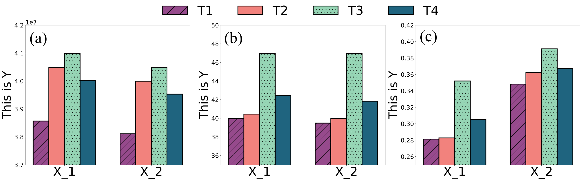
xxxxxxxxxx#encoding utf-8import matplotlib.pyplot as pltimport numpy as npimport matplotlibfont = 16plt.rc('ytick', labelsize=font+6)bar_labels = ['T1','T2','T3','T4']
# 创建子图fig, axs = plt.subplots(1, 3, figsize=(30, 8.5))# 设置柱子的颜色color1 = '#964a8c'   #'#7C1D6F'color2 = '#f2827d'color3 = '#96d5b5'color4 = '#1f647f'# 设置相同的颜色color_cycle = plt.rcParams['axes.prop_cycle'].by_key()['color']color_cycle = [color1,color2,color3,color4]
# 设置柱宽和柱间隔bar_width = 0.18bar_gap = 0.025font=26# 设置柱子的颜色# color1 = '#964a8c'   #'#7C1D6F'# color2 = '#f2827d'# color3 = '#96d5b5'# color4 = '#1f647f'# 红 蓝 灰 黄
x_values = ["X_1", "X_2"]  # x轴坐标# 计算每组柱的位置(4根柱子计算公式)bar_positions1 = np.arange(len(x_values)) - 1.5*bar_width   # 左边的柱位置bar_positions2 = np.arange(len(x_values)) - bar_width/2  # 右边的柱位置bar_positions3 = np.arange(len(x_values)) + bar_width/2  # 右边的柱位置bar_positions4 = np.arange(len(x_values)) + 1.5*bar_width   # 右边的柱位置
data1=[38567563,38110986]data2=[40482380,39993910]data3=[40990048,40489834]data4=[40013360,39531576]axs[0].bar(bar_positions1, data1, width=bar_width, label=bar_labels[0], color=color1, edgecolor='black', linewidth=3,zorder=10, hatch = '/')axs[0].bar(bar_positions2, data2, width=bar_width, label=bar_labels[1], color=color2, edgecolor='black', linewidth=3,zorder=10)axs[0].bar(bar_positions3, data3, width=bar_width, label=bar_labels[2], color=color3, edgecolor='black', linewidth=3,zorder=10,hatch = '.')axs[0].bar(bar_positions4, data4, width=bar_width, label=bar_labels[3], color=color4, edgecolor='black', linewidth=3,zorder=10)x_positions = np.arange(len(x_values))axs[0].set_xticks(x_positions, x_values, fontsize=font+20)axs[0].text(-0.3,41500000, '(a)', fontdict={'family': 'times new roman', 'size': font+33}, ha='center', va='center')axs[0].set_ylabel("This is Y",fontsize=font+18)

data1=[39.946951,39.481104]data2=[40.448513,39.976817]data3=[46.974343,46.960385]data4=[42.456602,41.832140]axs[1].bar(bar_positions1, data1, width=bar_width, label=bar_labels[0], color=color1, edgecolor='black', linewidth=3,zorder=10, hatch = '/')axs[1].bar(bar_positions2, data2, width=bar_width, label=bar_labels[1], color=color2, edgecolor='black', linewidth=3,zorder=10)axs[1].bar(bar_positions3, data3, width=bar_width, label=bar_labels[2], color=color3, edgecolor='black', linewidth=3,zorder=10,hatch = '.')axs[1].bar(bar_positions4, data4, width=bar_width, label=bar_labels[3], color=color4, edgecolor='black', linewidth=3,zorder=10)x_positions = np.arange(len(x_values))axs[1].set_xticks(x_positions, x_values, fontsize=font+20)axs[1].text(-0.3,48.5, '(b)', fontdict={'family': 'times new roman', 'size': font+33}, ha='center', va='center')axs[1].set_ylabel("This is Y",fontsize=font+18)


data1=[0.281301,0.348276]data2=[0.282715,0.362222]data3=[0.352019,0.391199]data4=[0.305245,0.367232]axs[2].bar(bar_positions1, data1, width=bar_width, label=bar_labels[0], color=color1, edgecolor='black', linewidth=3,zorder=10, hatch = '/')axs[2].bar(bar_positions2, data2, width=bar_width, label=bar_labels[1], color=color2, edgecolor='black', linewidth=3,zorder=10)axs[2].bar(bar_positions3, data3, width=bar_width, label=bar_labels[2], color=color3, edgecolor='black', linewidth=3,zorder=10,hatch = '.')axs[2].bar(bar_positions4, data4, width=bar_width, label=bar_labels[3], color=color4, edgecolor='black', linewidth=3,zorder=10)x_positions = np.arange(len(x_values))axs[2].set_xticks(x_positions, x_values, fontsize=font+20)axs[2].text(-0.3,0.405, '(c)', fontdict={'family': 'times new roman', 'size': font+33}, ha='center', va='center')axs[2].set_ylabel("This is Y",fontsize=font+18)lines, labels = fig.axes[0].get_legend_handles_labels()
legend = fig.legend( lines, labels,            loc='upper center',ncol=4, framealpha=1,fontsize=font+20,frameon=False)legend.set_bbox_to_anchor((0.515, 1.132))
axs[0].set_ylim(37000000,42000000)axs[1].set_ylim(35,50)axs[2].set_ylim(0.25,0.42)
# 调整布局,以防止子图之间的重叠
plt.tight_layout()fig.savefig("model2.pdf", format="pdf", bbox_extra_artists=(legend,),bbox_inches="tight")# 显示图形plt.show()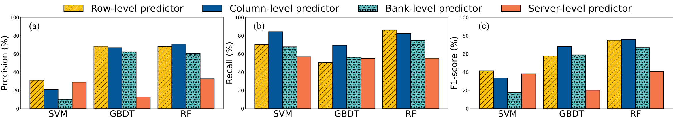
图来源(USENIX ATC'24) 配色方案:
xxxxxxxxxxcolor1 = '#FAC110' color2 = '#03569A' color3 = '#60C6C8' color4 = '#F3764A'Case3:三子图折线图
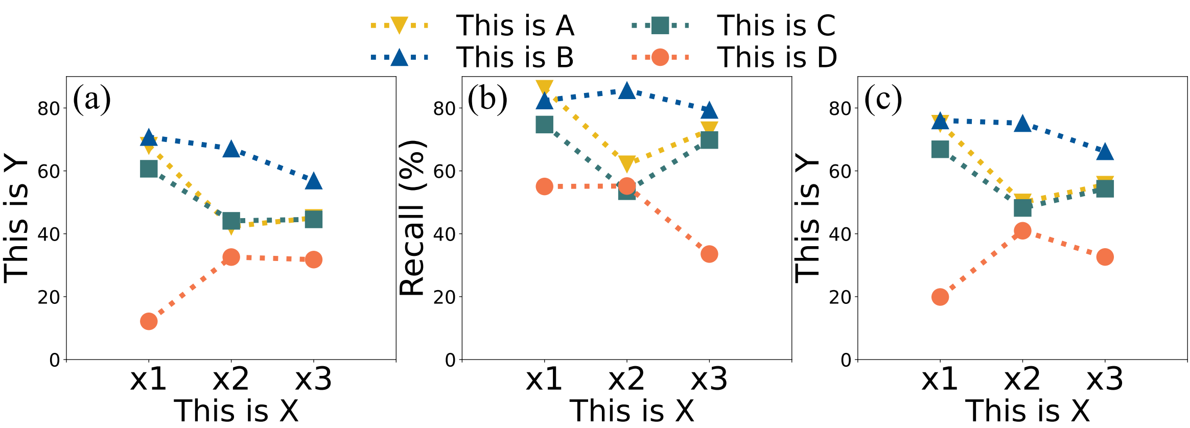
xxxxxxxxxximport matplotlib.pyplot as pltimport numpy as npfont = 24plt.rc('ytick', labelsize=font-2)
# 创建子图fig, axs = plt.subplots(1, 3, figsize=(24, 6.1),sharex = True)
x_axis = ['','x1','x2','x3','']  # x轴坐标  为了像论文里横坐标刻度和Y轴、图右边界保持一定距离,曲线救国横坐标两边插个空y_axis = [0,20,40,60,80,100]
markers = ['v', '^','s','o']colors = ["#EAB81D", "#03569A","#397677","#f3764a"] # 黄 红 蓝line_styles=['dotted','dotted','dotted','dotted']max_data = 0min_data = 100
#obdata1=[0.679957538,0.423406689,0.450313362]data2=[0.707521015,0.67085179,0.569129676]data3=[0.606680313,0.441117913,0.44578232]data4=[0.121492852,0.325912585,0.317859635]
data1 = [idx * 100 for idx in data1]data2 = [idx * 100 for idx in data2]data3 = [idx * 100 for idx in data3]data4 = [idx * 100 for idx in data4]

max_data = max(max(data1),max_data,max(data2),max(data3),max(data4))min_data = min(min(data1),min_data,min(data2),min(data3),min(data4))print(min_data)
data = {    'This is A': data1,    'This is B': data2,    'This is C': data3,    'This is D': data4}
for i, (line_name, y_values) in enumerate(data.items()):    x_values = np.arange(len(y_values))    axs[0].plot(x_values+1, y_values, marker=markers[i], label=line_name, markersize=20, linewidth=6, color=colors[i],linestyle=line_styles[i])
x_position = np.arange(len(x_axis))axs[0].set_xticks(x_position,x_axis,fontsize=font+14)axs[0].set_ylim(0, 100)axs[0].set_ylabel("This is Y",fontsize=font+14)axs[0].text(0.31,82.5, '(a)', fontdict={'family': 'times new roman', 'size': font+18}, ha='center', va='center')at1=axs[0].text(2.065,-17, 'This is X', va='center', ha='center',fontsize=font+12)

#obdata1=[0.861105263,0.620974244,0.729313287]data2=[0.823703704,0.856273063,0.79382716]data3=[0.747348901,0.535341201,0.698044097]data4=[0.550366324,0.551837417,0.335526316]

data1 = [idx * 100 for idx in data1]data2 = [idx * 100 for idx in data2]data3 = [idx * 100 for idx in data3]data4 = [idx * 100 for idx in data4]max_data = max(max(data1),max_data,max(data2),max(data3),max(data4))min_data = min(min(data1),min_data,min(data2),min(data3),min(data4))data = {    'This is A': data1,    'This is B': data2,    'This is C': data3,    'This is D': data4}
print(min_data)
for i, (line_name, y_values) in enumerate(data.items()):    x_values = np.arange(len(y_values))    axs[1].plot(x_values+1, y_values, marker=markers[i], label=line_name, markersize=20, linewidth=6, color=colors[i],linestyle=line_styles[i])
x_position = np.arange(len(x_axis))axs[1].set_xticks(x_position,x_axis,fontsize=font+14)axs[1].set_ylim(0, 100)axs[1].set_ylabel("Recall (%)",fontsize=font+14)# axs[1].legend(loc="upper right", bbox_to_anchor=(0.9, 1.02), fontsize=30, ncol=4, labelspacing=0.4, handletextpad=0.02, frameon=False)axs[1].text(0.31,82.5, '(b)', fontdict={'family': 'times new roman', 'size': font+18}, ha='center', va='center')at2=axs[1].text(2.065,-17, 'This is X', va='center', ha='center',fontsize=font+12)
#obdata1=[0.750049336,0.499694765,0.556074022]data2=[0.760208571,0.751764381,0.662255416]data3=[0.668729646,0.482154716,0.543203692]data4=[0.198943208,0.409625039,0.326210219]
data1 = [idx * 100 for idx in data1]data2 = [idx * 100 for idx in data2]data3 = [idx * 100 for idx in data3]data4 = [idx * 100 for idx in data4]max_data = max(max(data1),max_data,max(data2),max(data3),max(data4))min_data = min(min(data1),min_data,min(data2),min(data3),min(data4))data = {    'This is A': data1,    'This is B': data2,    'This is C': data3,    'This is D': data4}

for i, (line_name, y_values) in enumerate(data.items()):    x_values = np.arange(len(y_values))    axs[2].plot(x_values+1, y_values, marker=markers[i], label=line_name, markersize=20, linewidth=6, color=colors[i],linestyle=line_styles[i])
x_position = np.arange(len(x_axis))axs[2].set_xticks(x_position,x_axis,fontsize=font+14)axs[2].set_ylim(0, 100)axs[2].set_ylabel("This is Y",fontsize=font+14)print(min_data)axs[2].text(0.31,82.5, '(c)', fontdict={'family': 'times new roman', 'size': font+18}, ha='center', va='center')at3=axs[2].text(2.065,-17, 'This is X', va='center', ha='center',fontsize=font+12)low = max(0,int(min_data/10)*10-10)height = int(max_data / 10) * 10 + 10
print(height)print(low)y_values = []for i in range(int((height-low)/10)+1):    if i%2 == 0:        y_values.append(int(low+10*i))print(len(y_values))print(y_values)y_pos = np.arange(len(y_values))
axs[0].set_yticks(y_values)axs[1].set_yticks(y_values)axs[2].set_yticks(y_values)
print(low)axs[0].set_ylim(low,height)axs[1].set_ylim(low,height)axs[2].set_ylim(low,height)

lines, labels = fig.axes[0].get_legend_handles_labels()legend = fig.legend( lines, labels,            loc='upper center',ncol=2, framealpha=1,fontsize=font+10,frameon=False,labelspacing=0.15,handletextpad=1)legend.set_bbox_to_anchor((0.42, 1.212))
plt.savefig("model3.pdf", format="pdf",bbox_extra_artists=(legend,at1,at2,at3,),bbox_inches="tight")plt.show()
Case4: CDF图
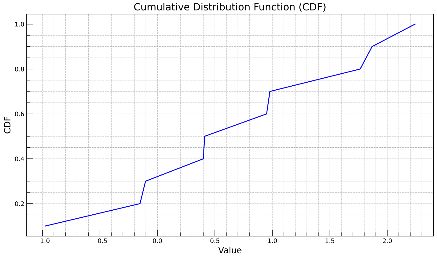
xxxxxxxxxximport numpy as npimport matplotlib.pyplot as plt
# 生成样本数据np.random.seed(0)data = np.random.randn(10)  # 生成10000个服从标准正态分布的样本
# 计算数据的CDFdata_sorted = np.sort(data)cdf = np.arange(1, len(data_sorted) + 1) / len(data_sorted)
# 创建图形fig, ax = plt.subplots(figsize=(10, 6))
# 绘制CDF曲线ax.plot(data_sorted, cdf, linestyle='-', marker='', color='blue')
# 设置图形标题和轴标签ax.set_title('Cumulative Distribution Function (CDF)', fontsize=16)ax.set_xlabel('Value', fontsize=14)ax.set_ylabel('CDF', fontsize=14)
# 添加网格线ax.grid(True, which='both', linestyle='--', linewidth=0.5)
# 设置刻度线的样式ax.minorticks_on()ax.tick_params(which='both', direction='in', length=6)ax.tick_params(which='major', length=10)ax.tick_params(axis='x', rotation=0)
# 显示图形plt.tight_layout()fig.savefig("model_cdf.pdf", format="pdf", bbox_inches="tight")plt.show()
Case5: Error bar
误差条(Error Bar)是用来表示数据不确定性或误差范围的图形元素
Error bar 柱状图
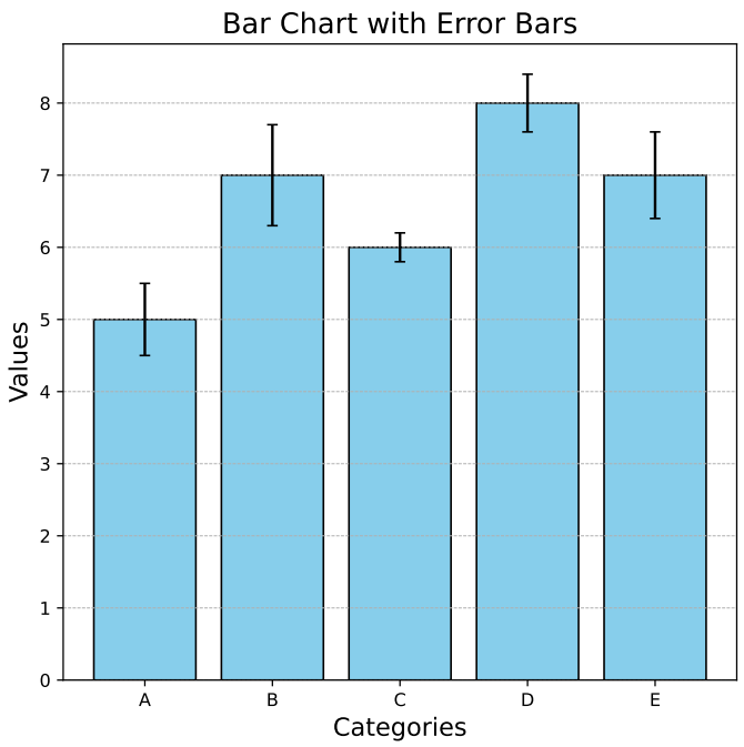
xxxxxxxxxximport numpy as npimport matplotlib.pyplot as plt
# 样本数据categories = ['A', 'B', 'C', 'D', 'E']values = [5, 7, 6, 8, 7]errors = [0.5, 0.7, 0.2, 0.4, 0.6]
# 创建图形fig, ax = plt.subplots(figsize=(6, 6))
# 绘制柱状图,并添加误差条bars = ax.bar(categories, values, yerr=errors, capsize=3, color='skyblue', edgecolor='black')
# 设置图形标题和轴标签ax.set_title('Bar Chart with Error Bars', fontsize=16)ax.set_xlabel('Categories', fontsize=14)ax.set_ylabel('Values', fontsize=14)
# 添加网格线ax.grid(True, which='both', linestyle='--', linewidth=0.5, axis='y')
# 显示图形plt.tight_layout()fig.savefig("model_error_bar.pdf", format="pdf",bbox_inches="tight")plt.show()
Error bar 折线图
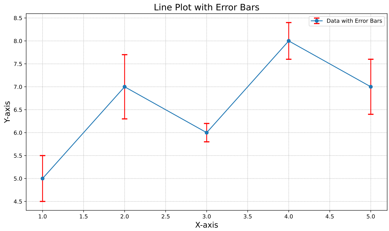
xxxxxxxxxximport numpy as npimport matplotlib.pyplot as plt
# 样本数据x = np.array([1, 2, 3, 4, 5])y = np.array([5, 7, 6, 8, 7])errors = np.array([0.5, 0.7, 0.2, 0.4, 0.6])
# 创建图形fig, ax = plt.subplots(figsize=(10, 6))
# 绘制折线图,并添加误差条ax.errorbar(x, y, yerr=errors, fmt='-o', ecolor='red', capsize=5, capthick=2, elinewidth=1.5, label='Data with Error Bars')
# 设置图形标题和轴标签ax.set_title('Line Plot with Error Bars', fontsize=16)ax.set_xlabel('X-axis', fontsize=14)ax.set_ylabel('Y-axis', fontsize=14)
# 添加图例ax.legend()
# 添加网格线ax.grid(True, which='both', linestyle='--', linewidth=0.5)
# 显示图形plt.tight_layout()fig.savefig("model_error_line.pdf", format="pdf",bbox_inches="tight")plt.show()
Case6 : Stacked Bar
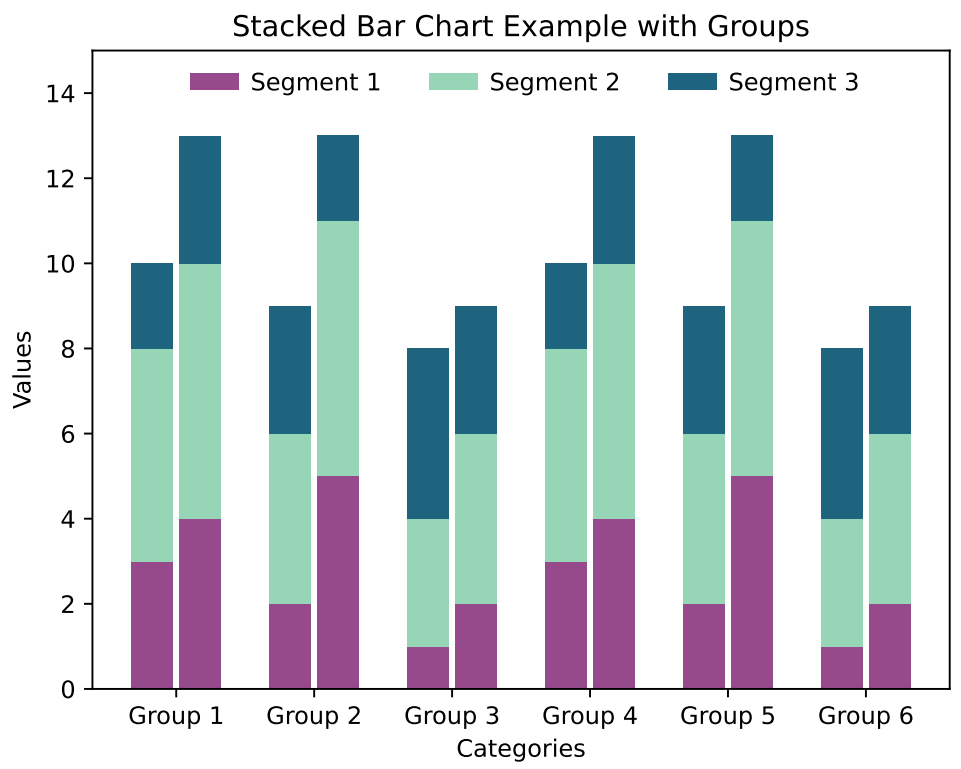
xxxxxxxxxximport matplotlib.pyplot as pltimport numpy as np
# 示例数据categories = ['Group 1', 'Group 2', 'Group 3', 'Group 4', 'Group 5', 'Group 6']segment1 = [3, 4, 2, 5, 1, 2, 3, 4, 2, 5, 1, 2]segment2 = [5, 6, 4, 6, 3, 4, 5, 6, 4, 6, 3, 4]segment3 = [2, 3, 3, 2, 4, 3, 2, 3, 3, 2, 4, 3]
# 设置柱体的位置x = np.arange(len(categories))width = 0.3  # 每个柱体的宽度gap = 0.05    # 每组柱体之间的间隙
# 创建堆积柱状图fig, ax = plt.subplots()
# 绘制每组中的第一个柱体rects1 = ax.bar(x - width/2 - gap/2, segment1[::2], width, label='Segment 1', color='#964a8c')rects2 = ax.bar(x - width/2 - gap/2, segment2[::2], width, bottom=segment1[::2], label='Segment 2', color='#96d5b5')rects3 = ax.bar(x - width/2 - gap/2, segment3[::2], width, bottom=np.array(segment1[::2]) + np.array(segment2[::2]), label='Segment 3', color='#1f647f')
# 绘制每组中的第二个柱体rects4 = ax.bar(x + width/2 + gap/2, segment1[1::2], width,  color='#964a8c')rects5 = ax.bar(x + width/2 + gap/2, segment2[1::2], width, bottom=segment1[1::2], color='#96d5b5')rects6 = ax.bar(x + width/2 + gap/2, segment3[1::2], width, bottom=np.array(segment1[1::2]) + np.array(segment2[1::2]),color='#1f647f')
# 添加标题和标签ax.set_xlabel('Categories')ax.set_ylabel('Values')ax.set_title('Stacked Bar Chart Example with Groups')ax.set_xticks(x)ax.set_xticklabels(categories)ax.set_ylim(0,15)ax.legend(loc="upper right", bbox_to_anchor=(0.92, 1.0), ncol=3, frameon=False,handletextpad=0.5)fig.savefig("model_stack_bar.pdf", format="pdf",bbox_inches="tight")# 显示图表plt.show()
颜色选择:
图源:TreeSLS (SOSP'23)
xxxxxxxxxxCOLOR1 = '#c13639'COLOR2 = '#f09b7b'COLOR3 = '#fee5d7'COLOR4 = '#e9e9e9'COLOR5 = '#b3b3b3'COLOR6 = '#656565'